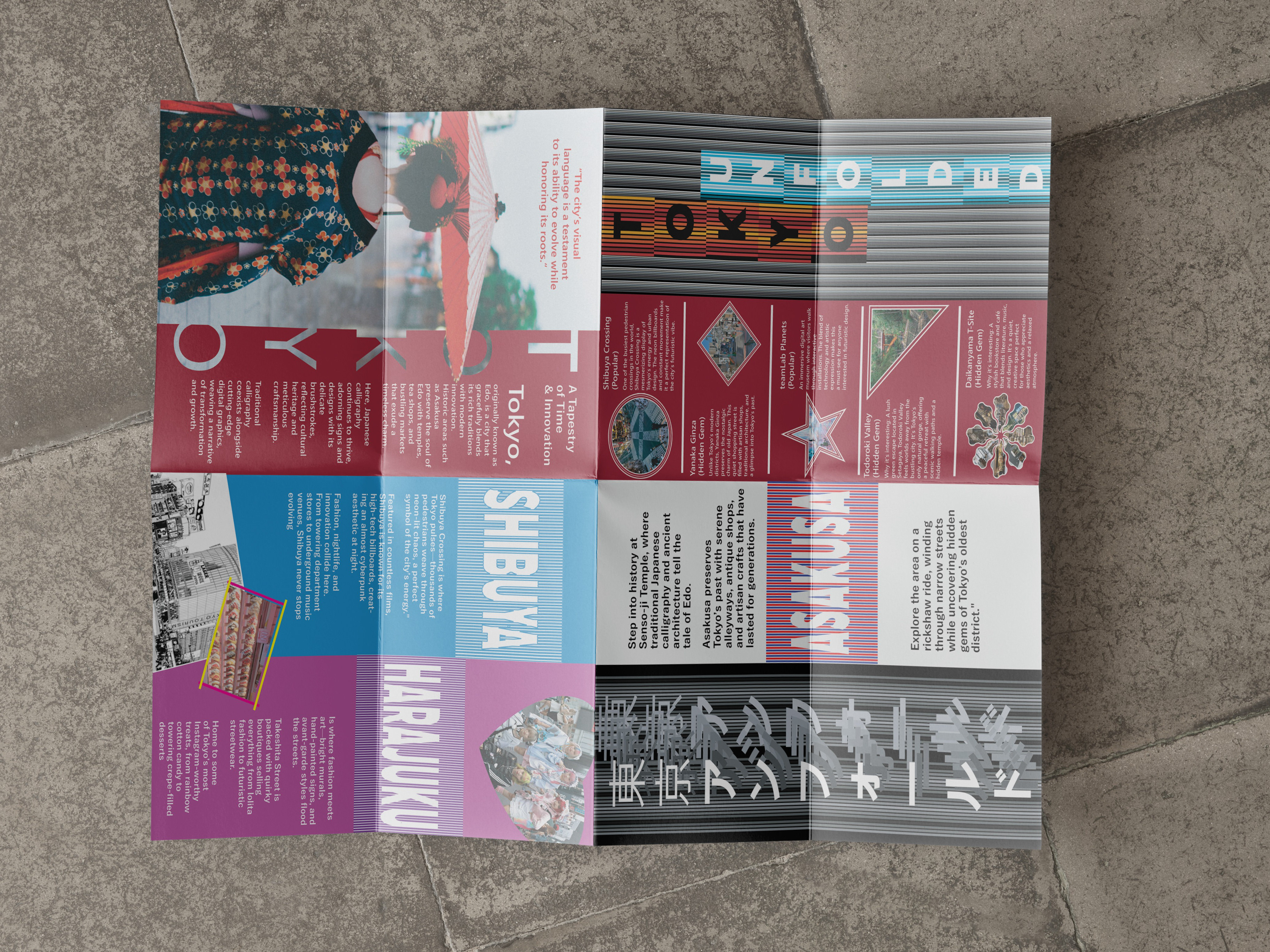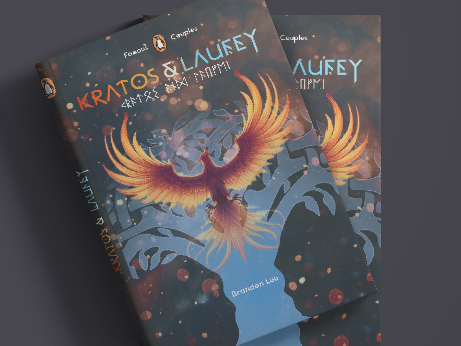
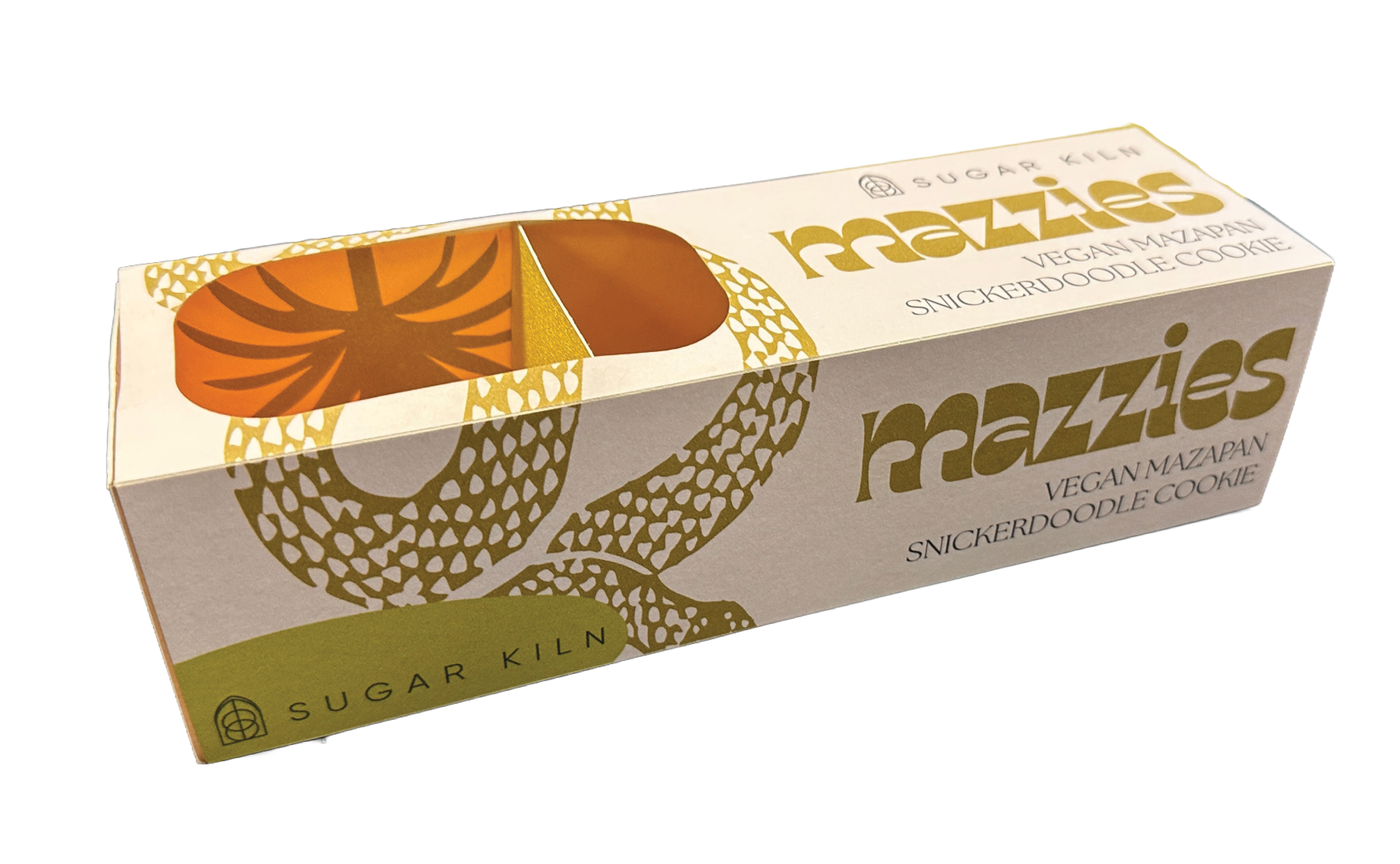
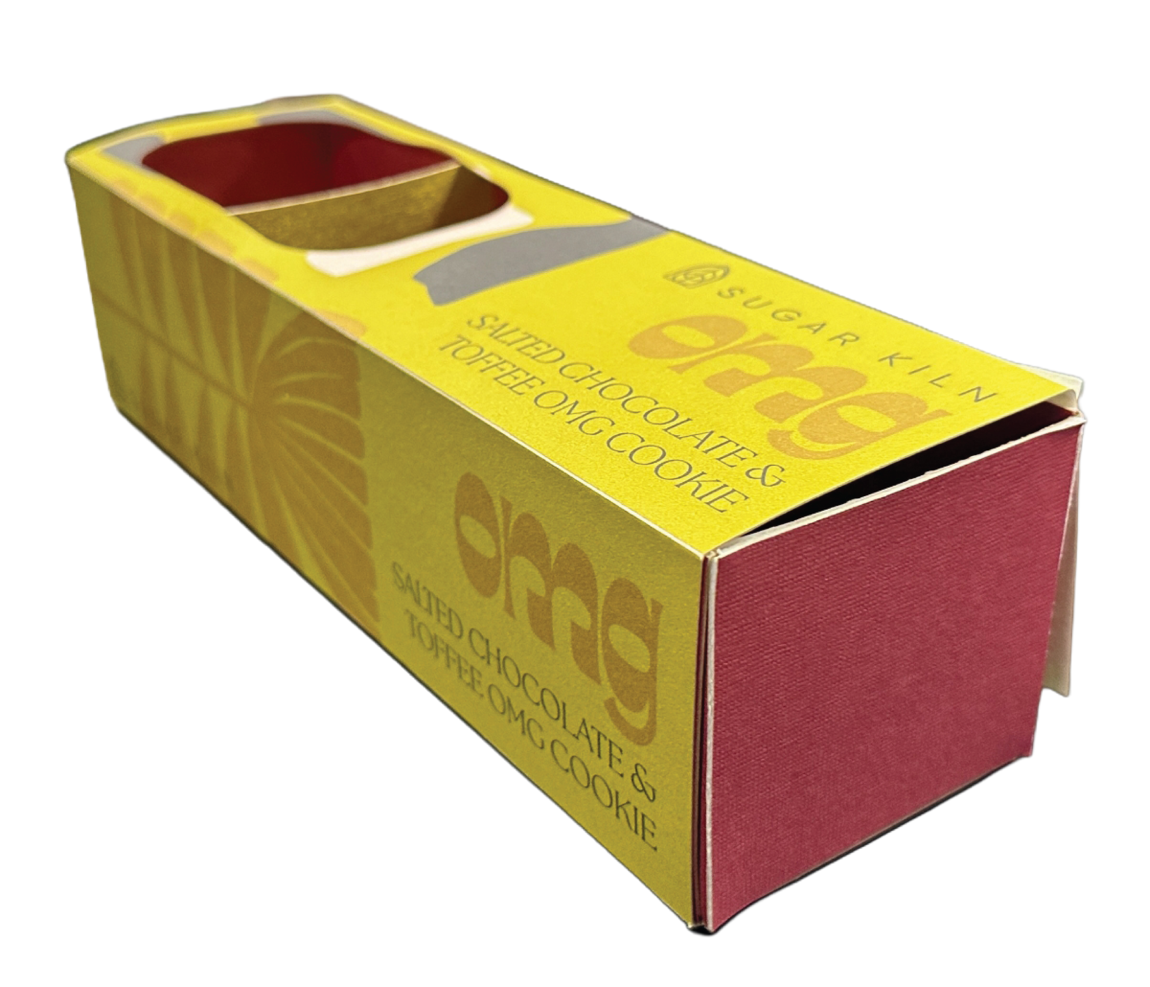
Branding Packaging:
Sugar Kiln Cookie Boxes
-
PROJECT OVERVIEW
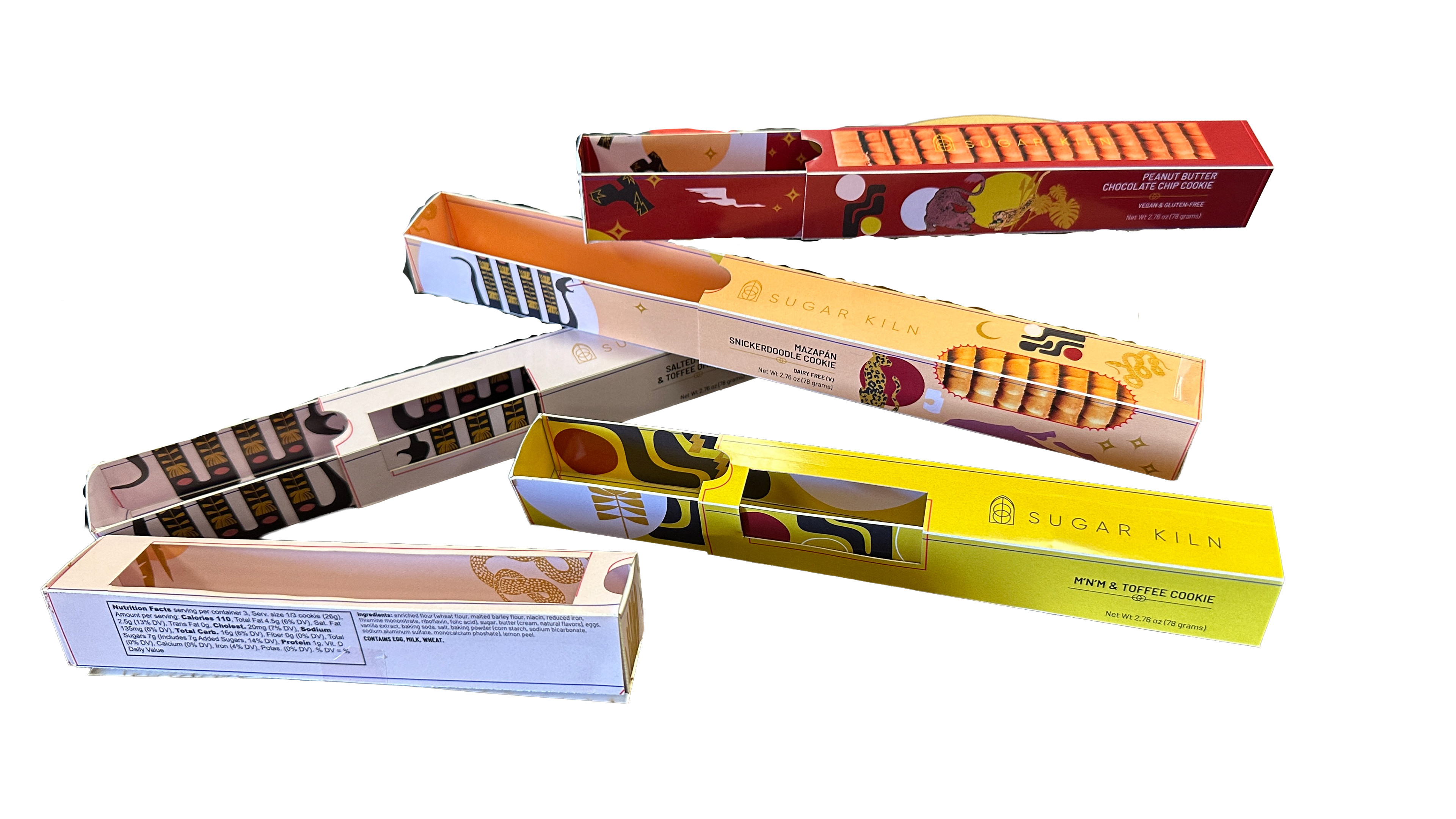
This project focused on the rapid development and brand evolution of custom packaging
for Sugar Kiln, a boutique, woman-owned bakery based in San Diego’s Barrio Logan.
The primary objective was to design a new suite of cookie boxes within an ambitious
six-week timeline to accommodate the brand's shift from high-end catering to
community-focused retail and wholesale. Drawing from Chef Lea Marie Dennis’s
decade-long history of "hard work and love," the designs aimed to transition the
product from a catering staple to a standalone retail icon. The goal was to maintain
the brand's rustic, "crackly" aesthetic while introducing a modernized typographic
identity that resonates with both local artisan shops and high-end museum partners.
Category
Packaging
Sugar Kiln
Packaging
Sugar Kiln
Personality
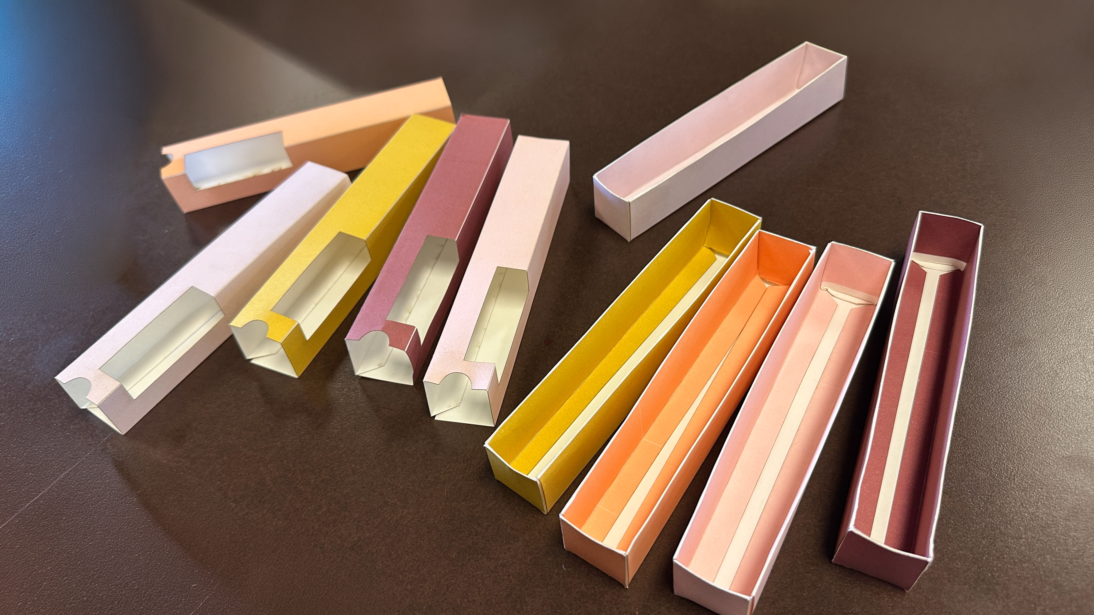
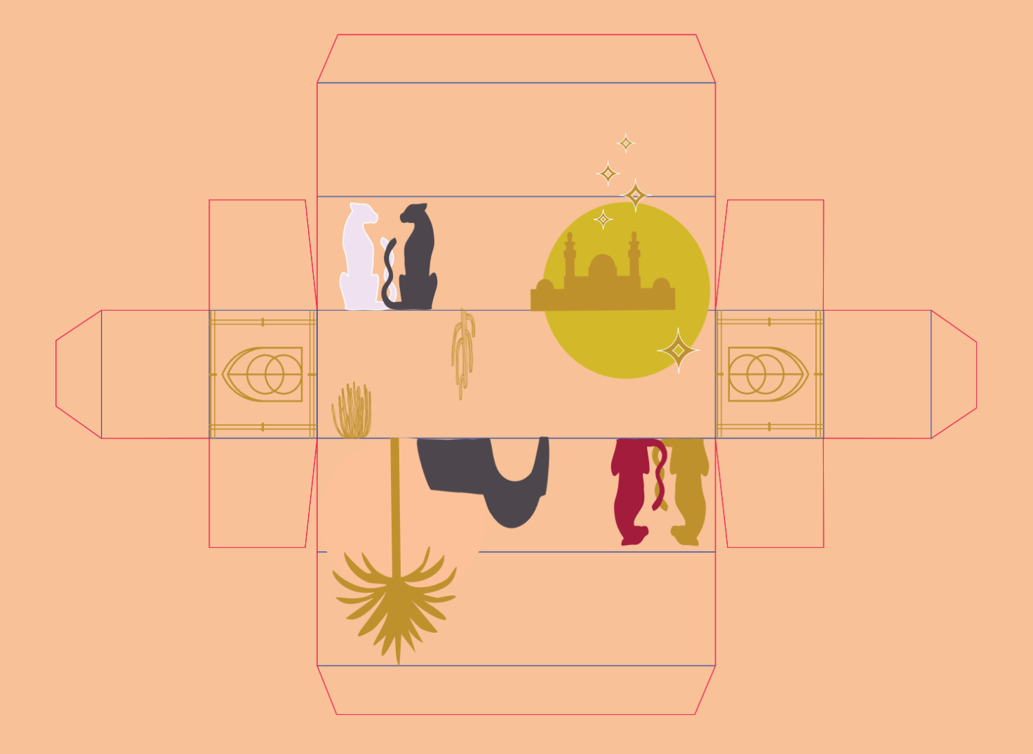
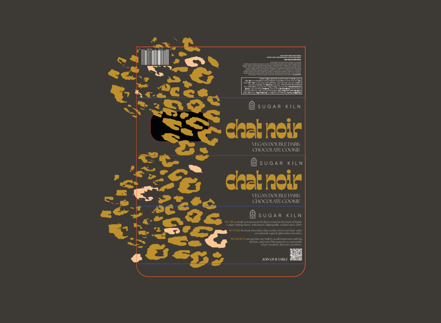
Cookie Box
Packaging Remodel
Cookie Box
Packaging Remodel
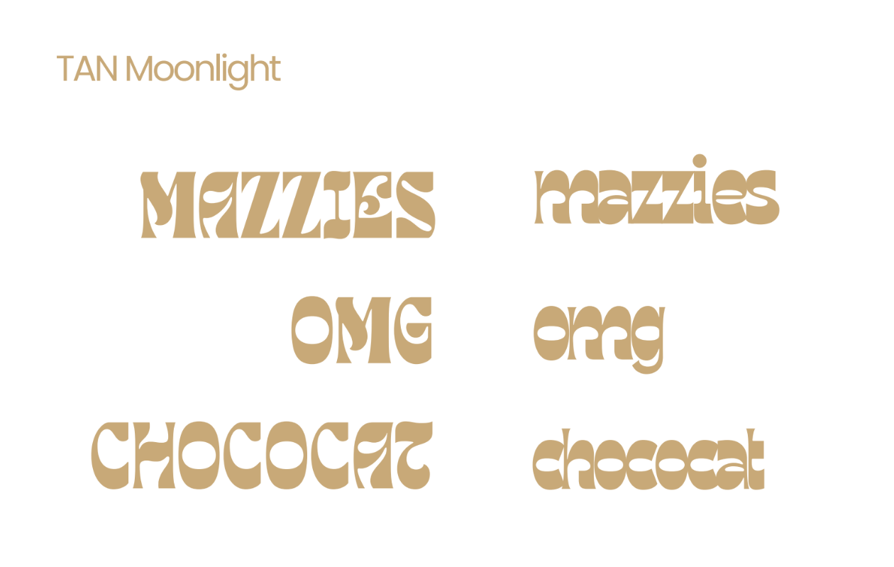
Fonts
Tan Moonlight
Barlow Condensed
Poppins
Tan Moonlight
Barlow Condensed
Poppins
Directors
Arzu Ozkal
Arzu Ozkal
Completed
2024
2024
-
APPROACH
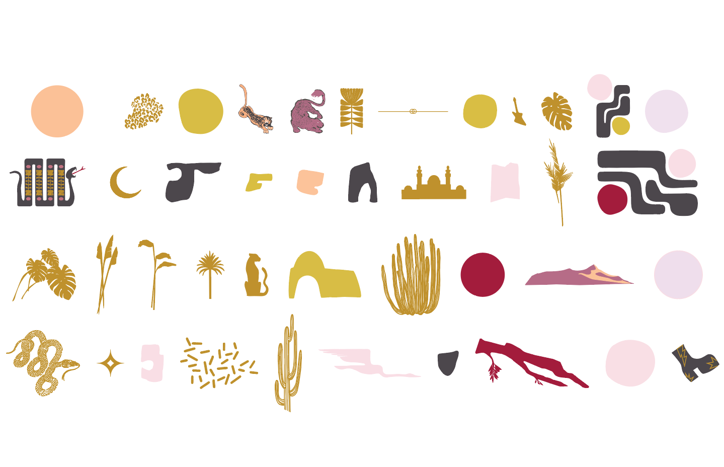
To honor Sugar Kiln’s heritage, we retained the original color palette to ensure brand continuity while pivoting toward a modern, character-driven typographic overhaul. By introducing expressive typefaces like TAN Rosebud and The Seasons alongside playful new product names—such as "MAZZIES" and "CHOCOCAT"—we gave the packaging a fresh, conversational energy. This iterative process was an eye-opener in balancing a founder’s nostalgic vision with the practical needs of retail-ready design; we navigated ongoing creative shifts by utilizing Perandory fonts for condensed clarity, ensuring that long, descriptive ingredient names remained legible within a minimalist, high-end box layout.