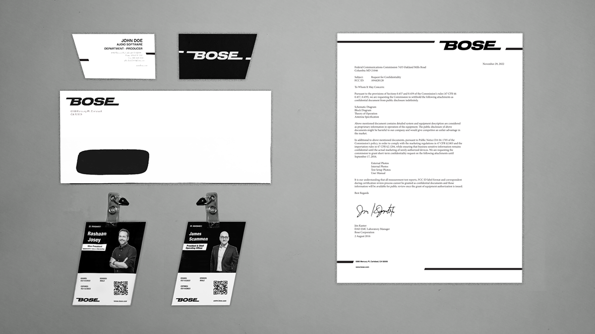
BOSE
-
Project Overview
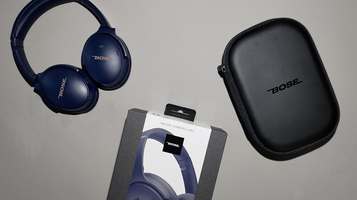
Bose is a well-known audio firm that has been producing high-quality sound for
many years. They recently chose to revamp their logo design, preserving the slanted appearance but making it more aggressive and modern. This revamp helps Bose to
maintain its position as an industry leader in sound technology while also keeping up
with current branding trends. Customers can be confident that when they buy Bose headphones or speakers, they are getting the same dependable sound quality that
Bose has always given.
Approach
An edgy approach was taken for this project. The solution was to use a similar italic font
and modified it - while still still having that futuristic innovated look as the original font
has. Using the slanted angles as from the original logo, I switched from top to bottom.
as I believe that was so iconic to the brand.
and modified it - while still still having that futuristic innovated look as the original font
has. Using the slanted angles as from the original logo, I switched from top to bottom.
as I believe that was so iconic to the brand.
Category
Corporate Rebrand
Corporate Rebrand
Personality
Corporate Rebrand
Logo Redesign
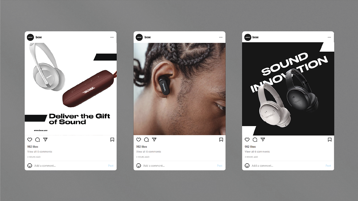
Sound Innovation
Corporate Rebrand
Logo Redesign
Sound Innovation
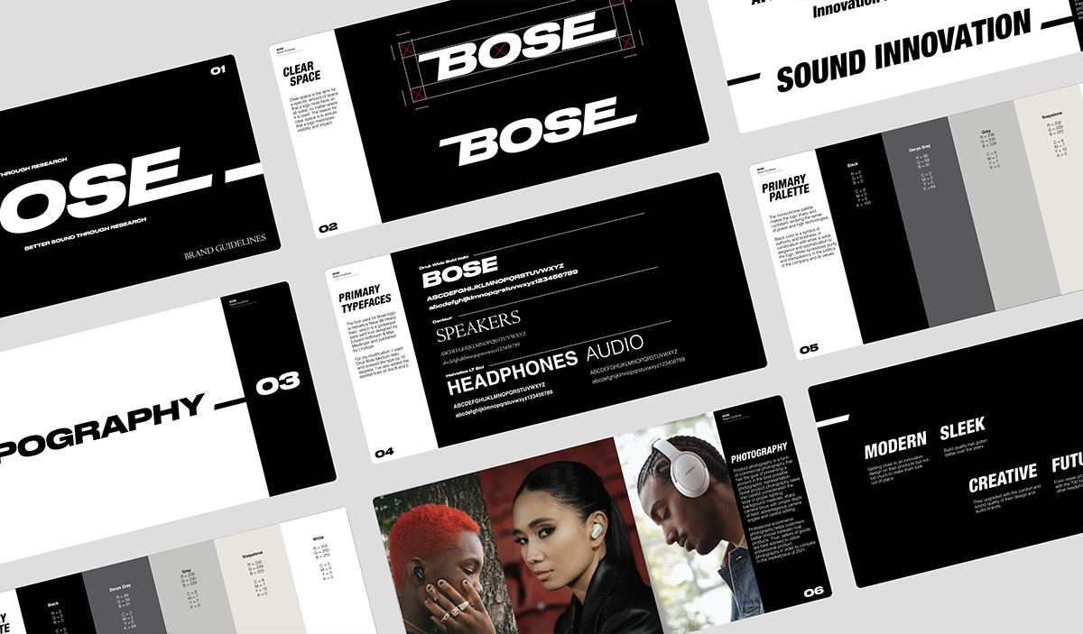
Fonts
Druk Medium italic
Druk Medium italic
Directors
Sean Bacon
Bradford Prairie
Sean Bacon
Bradford Prairie
Completed
2022
2022